ePCR 3.0 Update
ePCR 3.0: A Modernized Interface for a More Efficient Workflow
Coming in Q2 2025, ePCR 3.0 introduces a refreshed user interface with significant GUI improvements and redesigned screens, making documentation more intuitive, efficient, and responsive. This update enhances usability, improves navigation, and streamlines workflows to help teams complete reports faster and with greater ease.
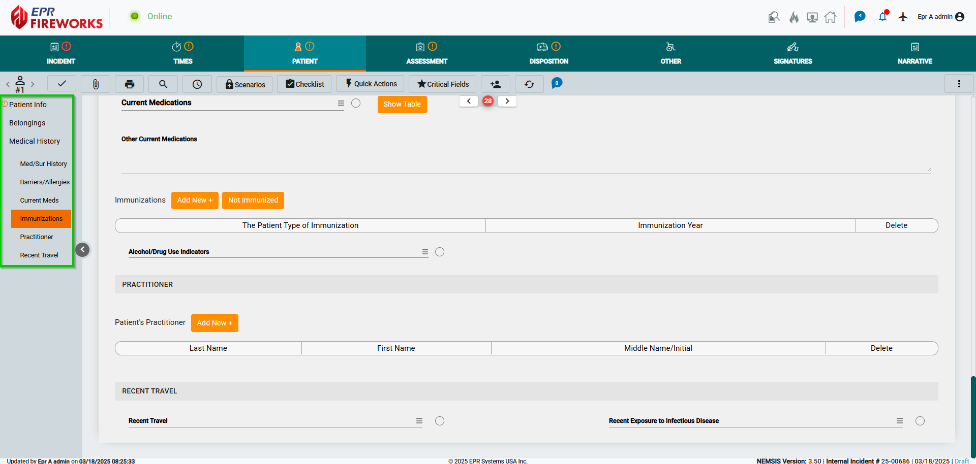
The updated GUI features optimized sidebars and submenus, providing a cleaner layout with improved navigation. Submenus are now collapsible across all devices, maximizing workspace, while continuous scrolling ensures seamless access to key sections, replacing table-based layouts with pop-up windows.
We’ve redesigned key screens to enhance functionality and efficiency. The updated layouts focus on faster data entry, a more structured workflow, and an improved user experience. The Vitals, Exam, and Treatments sections have been completely transformed to centralize information, reduce scrolling, and enhance accessibility.
With these enhancements, ePCR 3.0 delivers a modern, optimized experience that supports faster documentation, reduces redundancy, and improves overall efficiency.
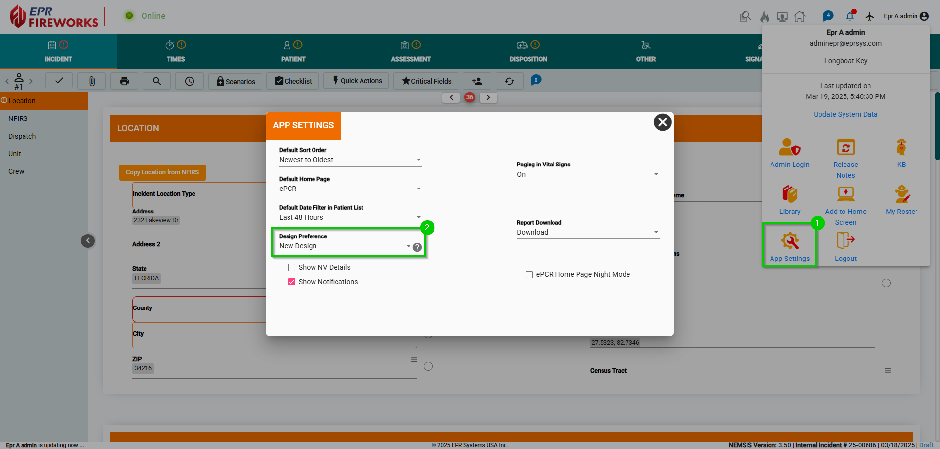
The Design Preference option in App Settings (user profile dropdown) lets you switch between the Standard and New designs. The Standard Design updates the overall ePCR appearance while keeping the Vitals, Treatments, and Exam screens unchanged. The New Design features a redesigned interface, including the new Vitals, Treatments, and Exam screens for a more streamlined experience.
GUI Improvements
Sidebars
We have optimized the sidebars throughout ePCR, enhancing usability and streamlining user experience.
Submenus
We enhanced the submenus with the following improvements:
Collapsible Submenus: Submenus can be collapsed on all devices, giving you more workspace in the main area.
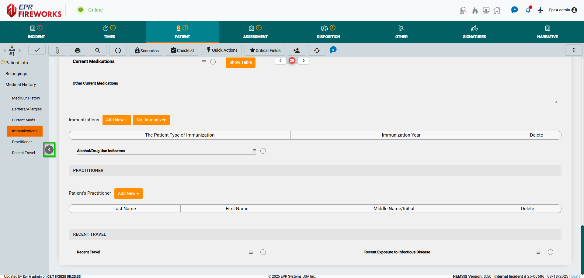
Continuous Scrolling: We added continuous scrolling to all submenus, simplifying navigation.
Popup Windows
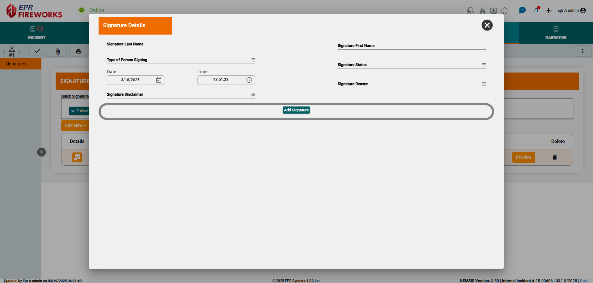
We replaced table-based layouts with streamlined popup windows, reducing clutter and making workflows more efficient. This improvement enhances usability, providing a cleaner and more responsive interface for faster data entry and navigation.
Reorganized Disposition Screen
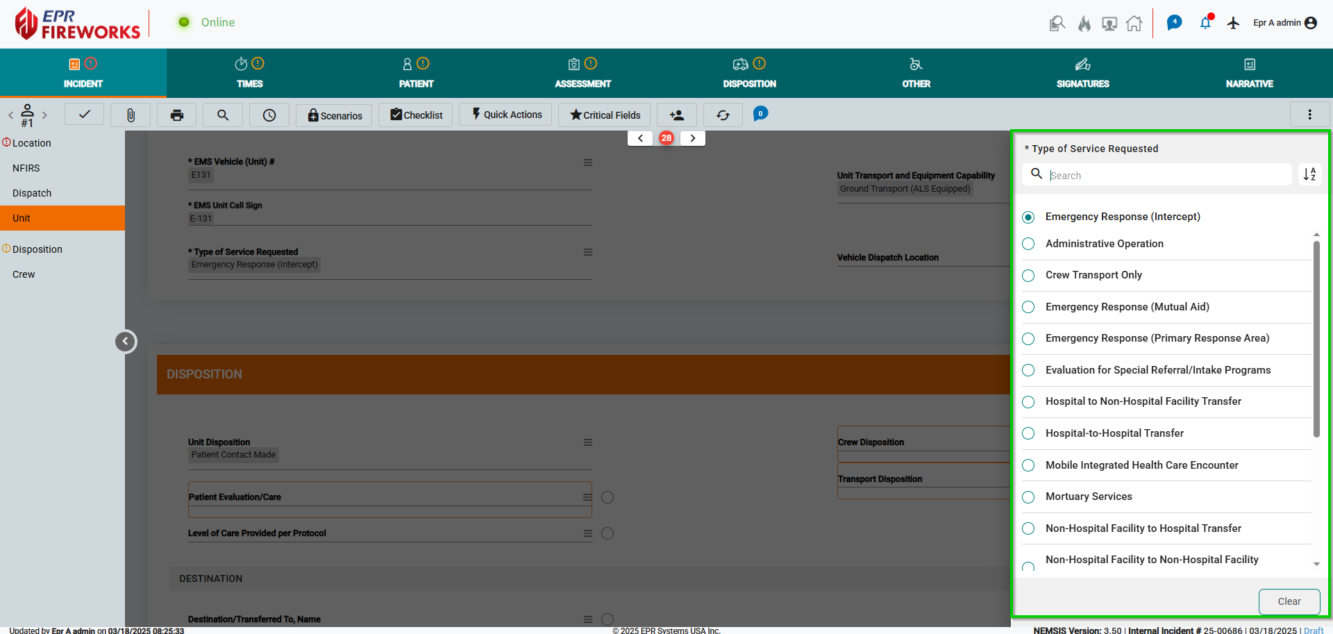
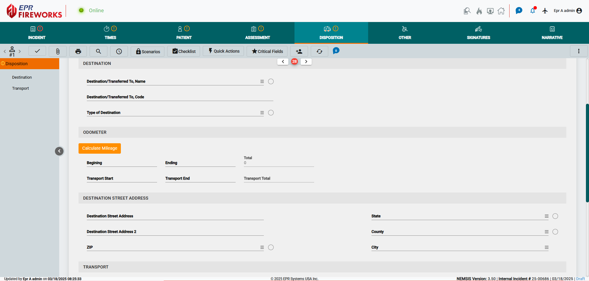
We reorganized the Disposition screen into Destination and Transport sections.
New Screens
Assessment > Vitals
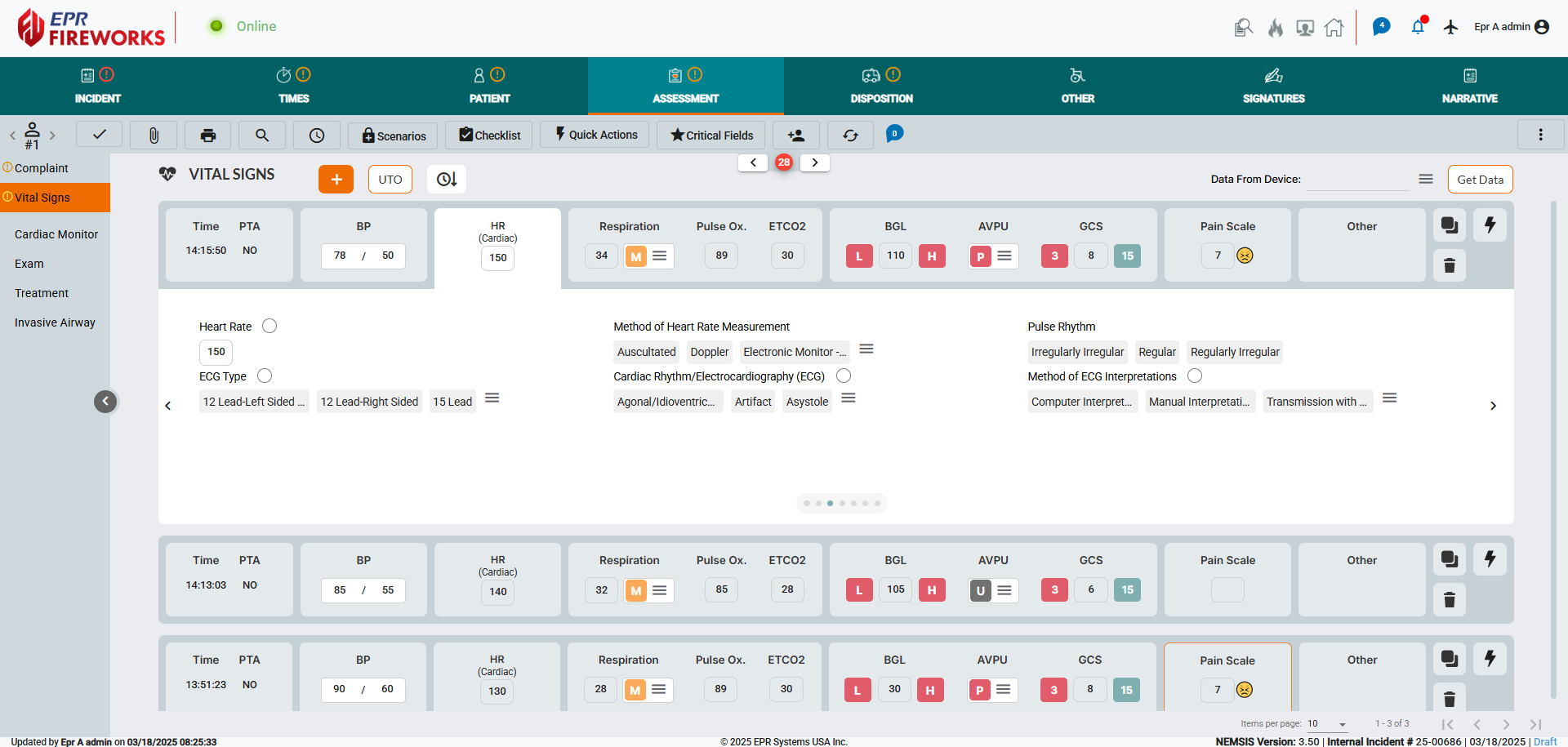
Introducing the all-new Vitals screen, designed to simplify data collection in the field. We have condensed all vital signs data into expandable tabs, enabling quick access to vitals. Key vitals are accessible directly from the grid.
Assessment > Exam
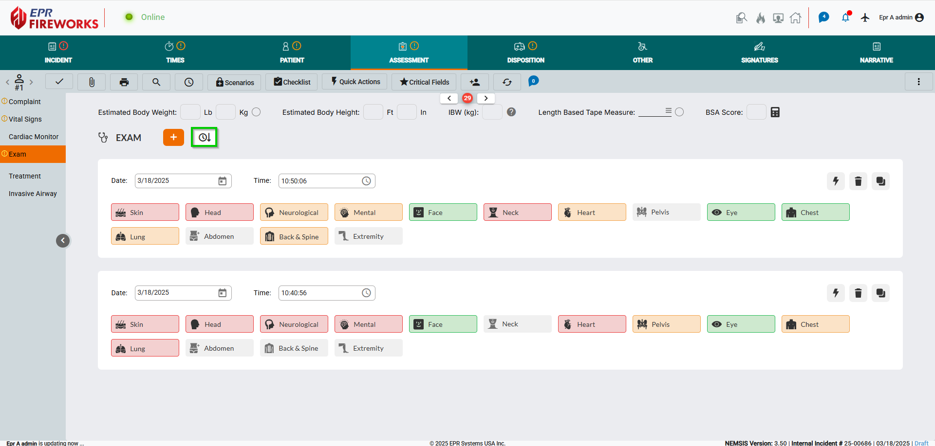
We simplified the Exam screen for faster field documentation:
Color-Coded Body Part Icons: Instantly see assessment status at a glance:
Red: Issue found
Orange: Not done
Green: Normal
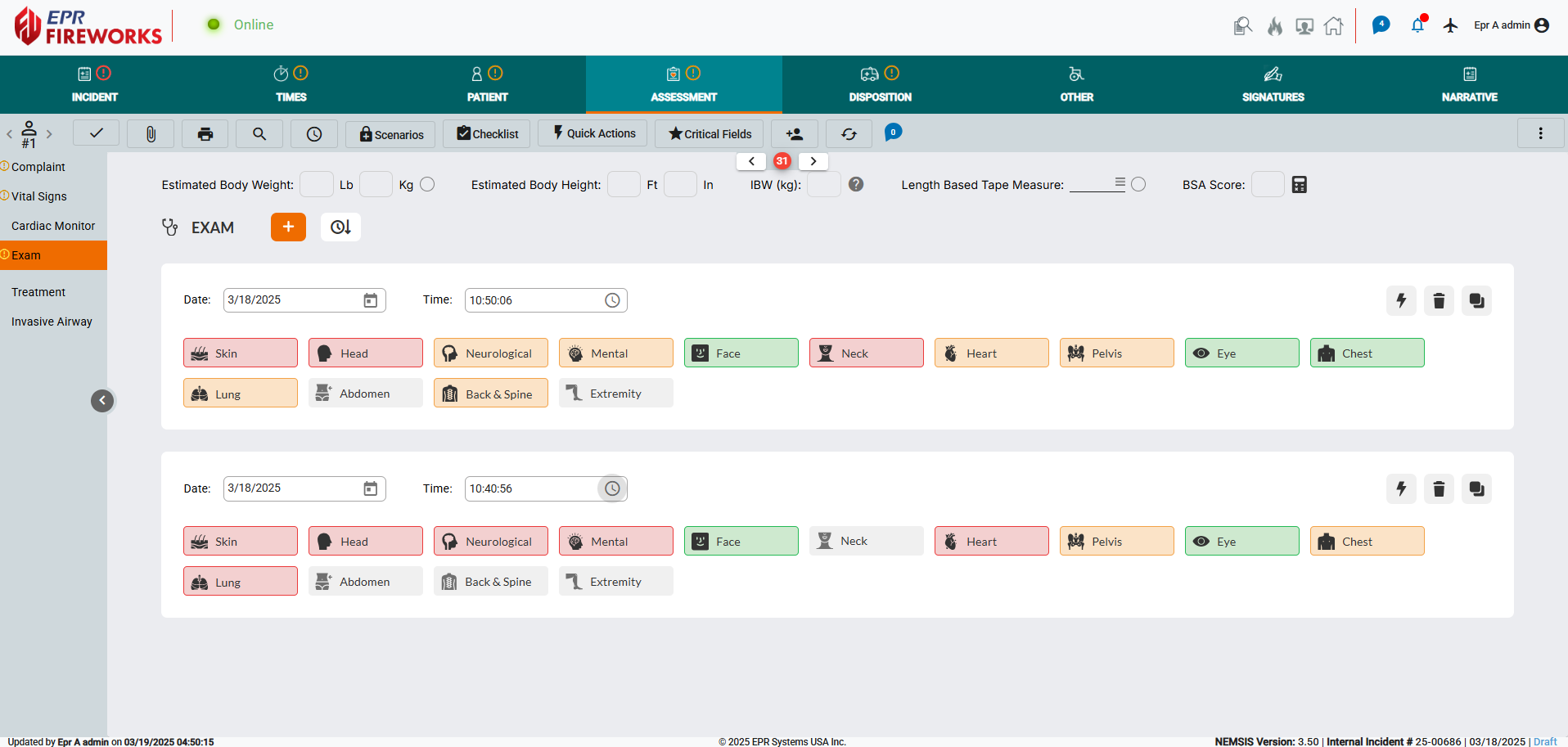
Streamlined Body Part Assessment: Assessments now open in pop-up windows for a more simplified and fluid workflow.
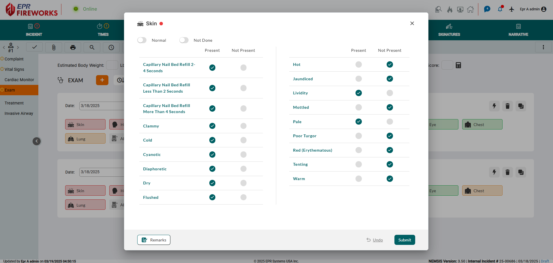
Simplified Limb Assessments: We consolidated limb assessments under a single Extremity section, making selection faster and more efficient. All locations are now organized in a single menu, with a Left/Right toggle for side specification.
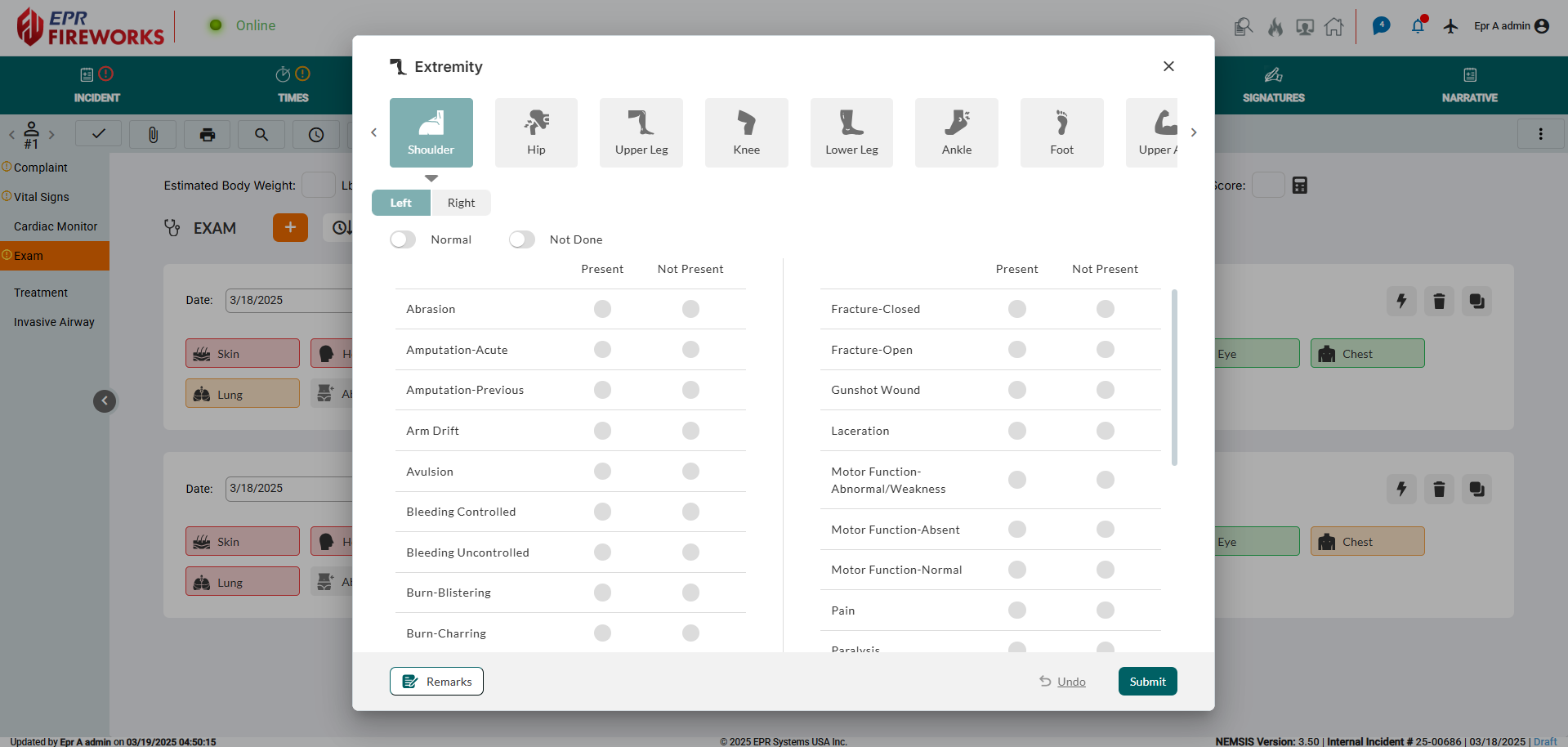
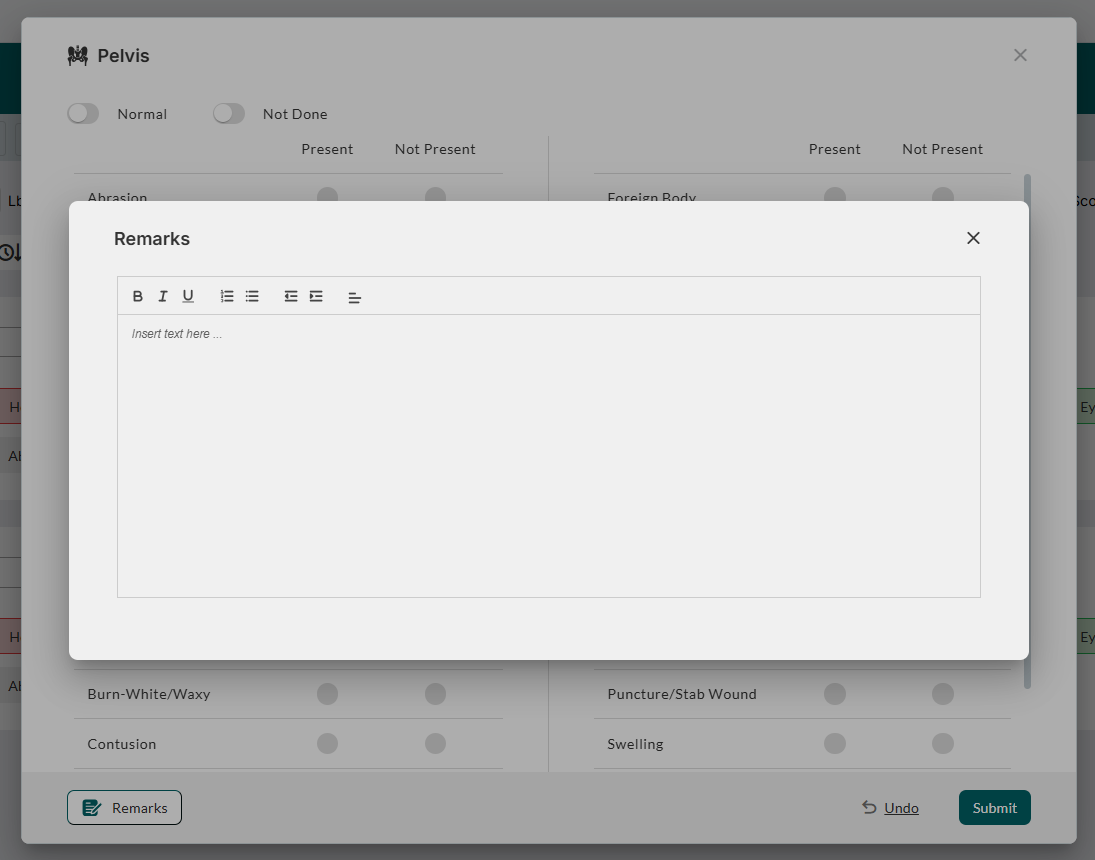
We enhanced the Normal or Not Done options at the top of each assessment popup for quick access.
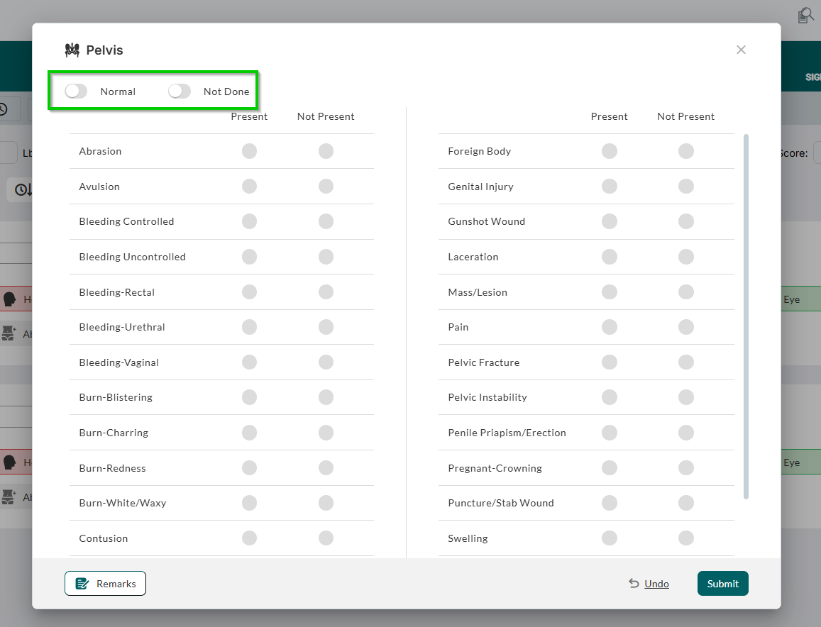
We added the Remarks feature within each assessment, to allow additional documentation.
We added the
 to enable sorting exams in chronological order.
Assessment > Treatment
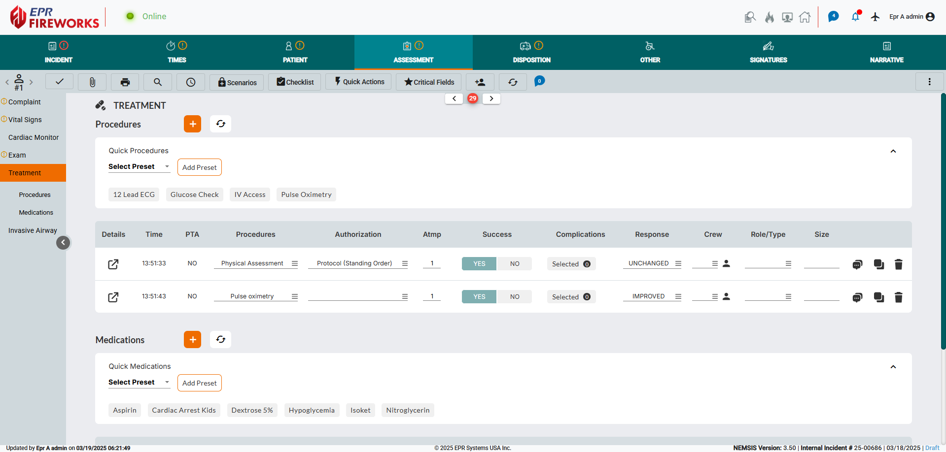
Understanding the complexity of the Treatment screen, we completely redesigned it to consolidate medications and procedures into an all-new streamlined interface. The Quick Actions section has been reorganized, improving accessibility to common items and optimizing the layout for a more efficient workflow.
Treatment Details
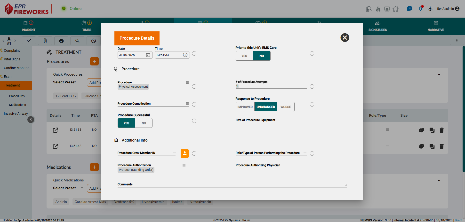
We redesigned the Treatment/Medication Details windows for a more intuitive and efficient workflow, presented in a clean, consolidated popup window. This update eliminates distractions, allowing users to focus on entering key treatment details quickly and accurately.
Narrative Screen
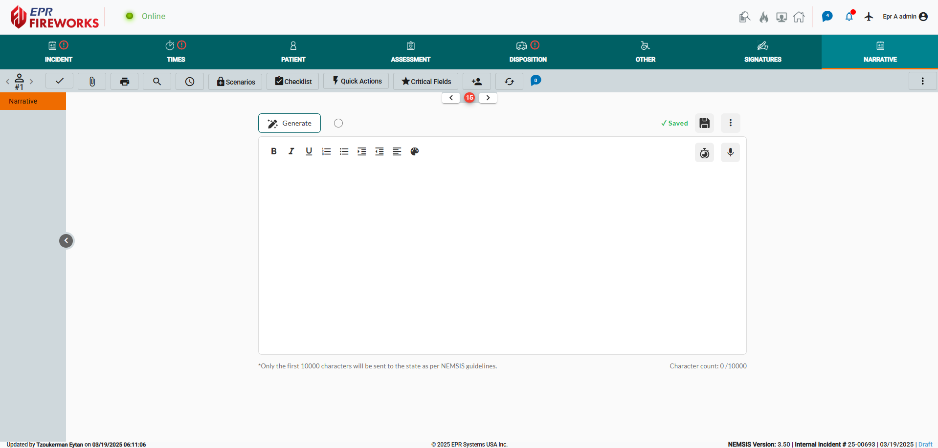
The Narrative screen has been redesigned with a modern, user-friendly interface that enhances readability and streamlines documentation. The updated layout features an intuitive toolbar, and improved formatting options, providing a cleaner and more structured workspace.
